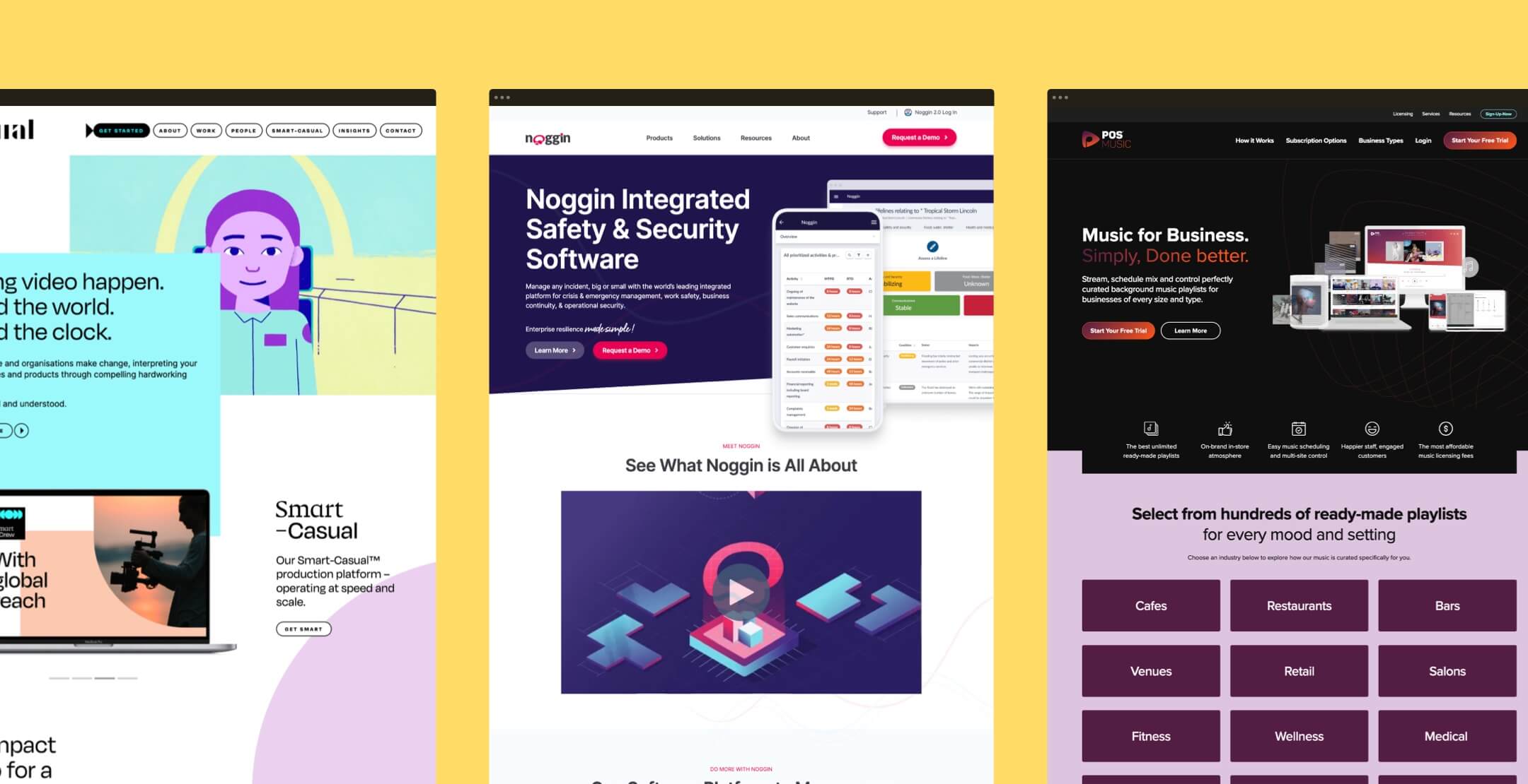
If you’ve ever owned a website, then you’ve likely spent plenty of hours (and dollars) designing it. After all, 94% of first impressions come from your website design. Think of your site as your house in the online world. Like a typical homeowner, you want it to look appealing so that visitors would stay longer.
But designing a website is like creating a floorplan: it can be hard—and googling how to do it can sometimes do more harm than good. Here are the 10 most common misconceptions about website design that you should avoid.
Myth #1: You don't need user feedback
Customer journey helps determine your website quality. A good website experience helps retain customers, while a bad experience can drive up to 30% of customers away. Despite that, only 55% of companies test their website’s user experience. Knowing what your users think about your website helps improve customer experience and determine whether a website redesign is in order.
Myth #2: A Website is all about the look
Think a cool website lets you get away with subpar or little content? Wrong. People visit your website for information. And if they can’t immediately access it, then you can kiss your engagement goodbye. Website design and content are like Buzz and Woody. One is flashy and draws in people, but the other brings the entire crew together. It’s a powerful partnership overall.
Myth #3: Web design should be mobile-first
60% of all web search traffic comes from mobile devices. That’s why Google now ranks mobile-friendly sites higher on the search engine. Keep in mind though that website experience is unique across industries. That is, some customers will engage better on desktop, while others will engage more on mobile. Knowing your audience can help you create a better website experience.
Myth #4: Websites are a Set and Forget Asset
They say, “If it isn’t broken, don’t fix it.” Most companies feel the same way about their website. If the links are working and the homepage is loading well, an update is unnecessary. But design trends change over time. For example, more websites are now using scrolltelling to transform their long-form content. You’ll be surprised what a few tweaks can do for your online presence.
Myth #5: Make it look great, then people will visit
Unlike the Taj Mahal, an aesthetically pleasing website can’t guarantee 8 million visitors per year. Part of that job goes to your website optimisation and social media marketing campaigns. These enable you to have the most relevant resources and reach a bigger audience. Knowing how to write a website brief can be crucial to optimising your web pages.
Myth #6: Just Because It’s Pretty Doesn’t Mean It Works
You’ll be shocked by how many businesses are willing to sacrifice their website’s function for style. But the truth is, nobody can enjoy interactive messages or blaring music on a website that’s confusing and hard to navigate. Site functionality plays into the customer experience. And like taking off an uncomfortable pair of heels, more than 40% of visitors will leave a website with poor functionality.
Myth #7: You Can’t Go Wrong with Minimalist
Going the minimalist route on your website design makes sense. It’s clean and sleek, and even Apple did it. But let’s face it: not everyone can be Apple. A minimalist design can look a bit bare if a great amount of information is crucial to your industry. Amazon, for example, isn’t minimalist, but it works. Choose a design that not only fits your brand but also delivers a consistent message about who you are.
Myth #8: Stock Photos Are the Devil
While we would highly recommend that you use your own images, not every company has the time to organise a photoshoot. So, using stock photos to enhance your website shouldn’t be off the table. Just know that other companies may have already used some of those photos and attached unwanted experiences to them. In that case, sourcing a unique stock photo is key.
Myth #9: The More Features, the Better
It’s tempting to put as many features as possible into your website. But listen—you don’t need image sliders on top of your image carousels, with links to 5 videos. Heck, you might not even need them. More isn’t always merrier. It clutters your website and derails customer experience, which automatically eliminates almost 90% of visitors. Sometimes, the best design simply conveys a clear message.
Myth #10: A Website Audit is a Waste of Time
To know whether your website is a quality one, you need to test it. This entails a comprehensive review to check weak spots and determine how to improve them. Knowing which features can reach people and by how much can help drive conversions, generate leads, and ensure that you maximize your data more efficiently in the future.
So, where to from here?
Taking all of this into consideration, are you thinking about your current website and how you've been battling these myths, thinking they are "best practice"? Or are you currently planning a new website and are trying to find what you should be considering?
Speak with us today and we can help you audit your website to find all of the potential areas of improvement and optimisation. Book a free 30-minute call to discuss your website and walk away with some tips on what you could do to improve it, on the house.


